Healthyish Snacks Cookbook

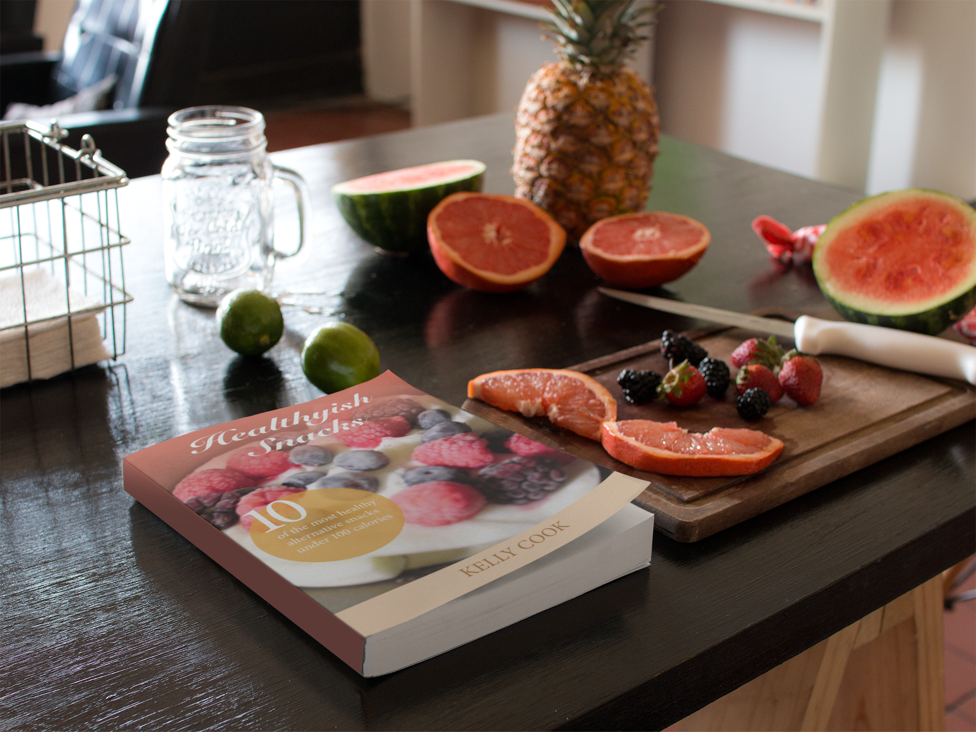
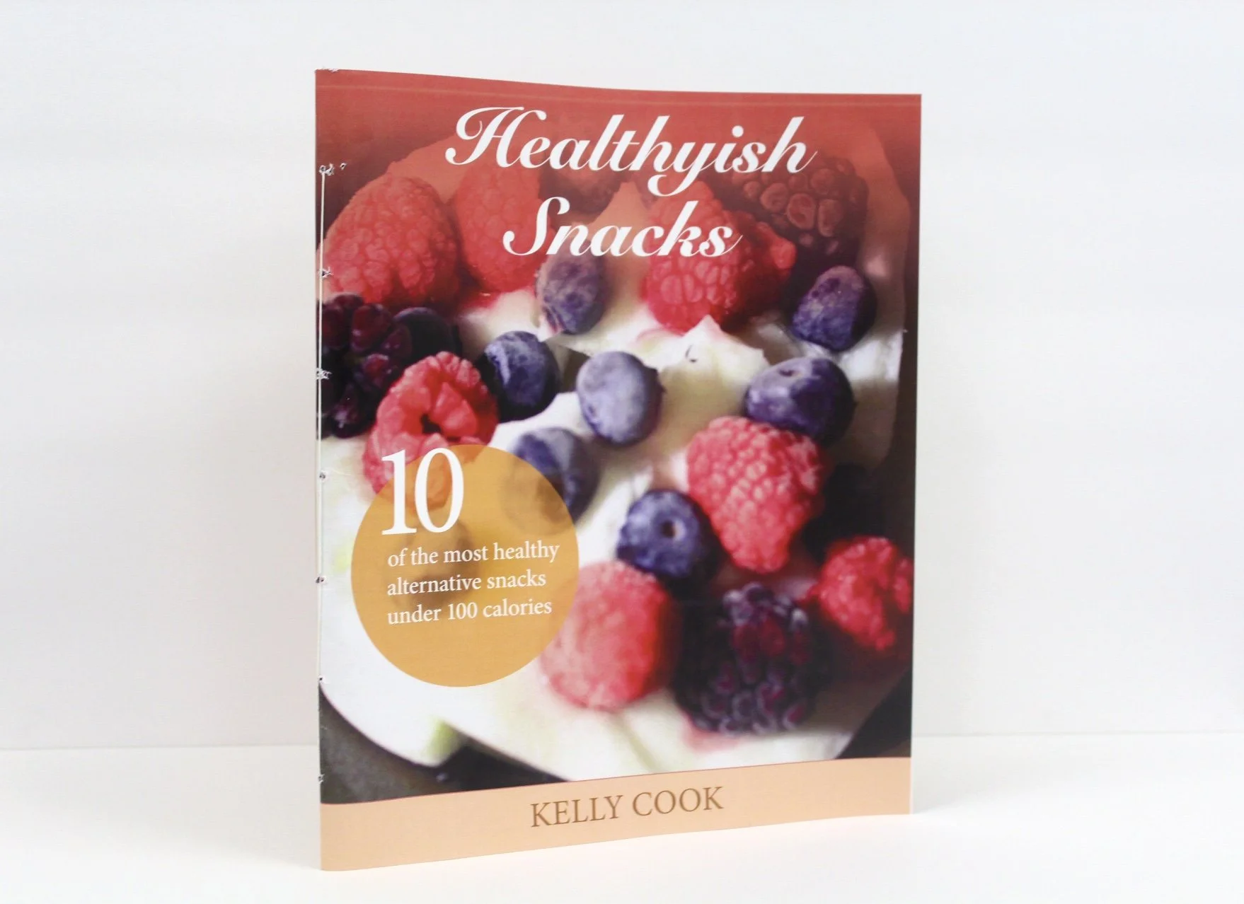
For my cookbook I decided to go with a healthy snack theme. This was ideal for me, because as a college student I am a huge snacker. However, I noticed that I was starting to eat quite unhealthy foods, because they are cheap and easy. I realized that this was starting to become a recurring dilemma. Therefore, I decided to look up on the internet super easy healthy alternative snacks that were still tasty, but much cleaner with their ingredients. I could make these snacks myself and store them in the fridge when I wanted a quick bite of something. The audience of my book is people who enjoy cooking healthy foods and are always looking for other alternatives to junk food. The concept I decided to go for was a colorful/fun clean theme that represented the food images on one side with the recipe on the other.


Healthyish Snacks Cookbook

Healthyish Snacks Cookbook

Structure of Cookbook

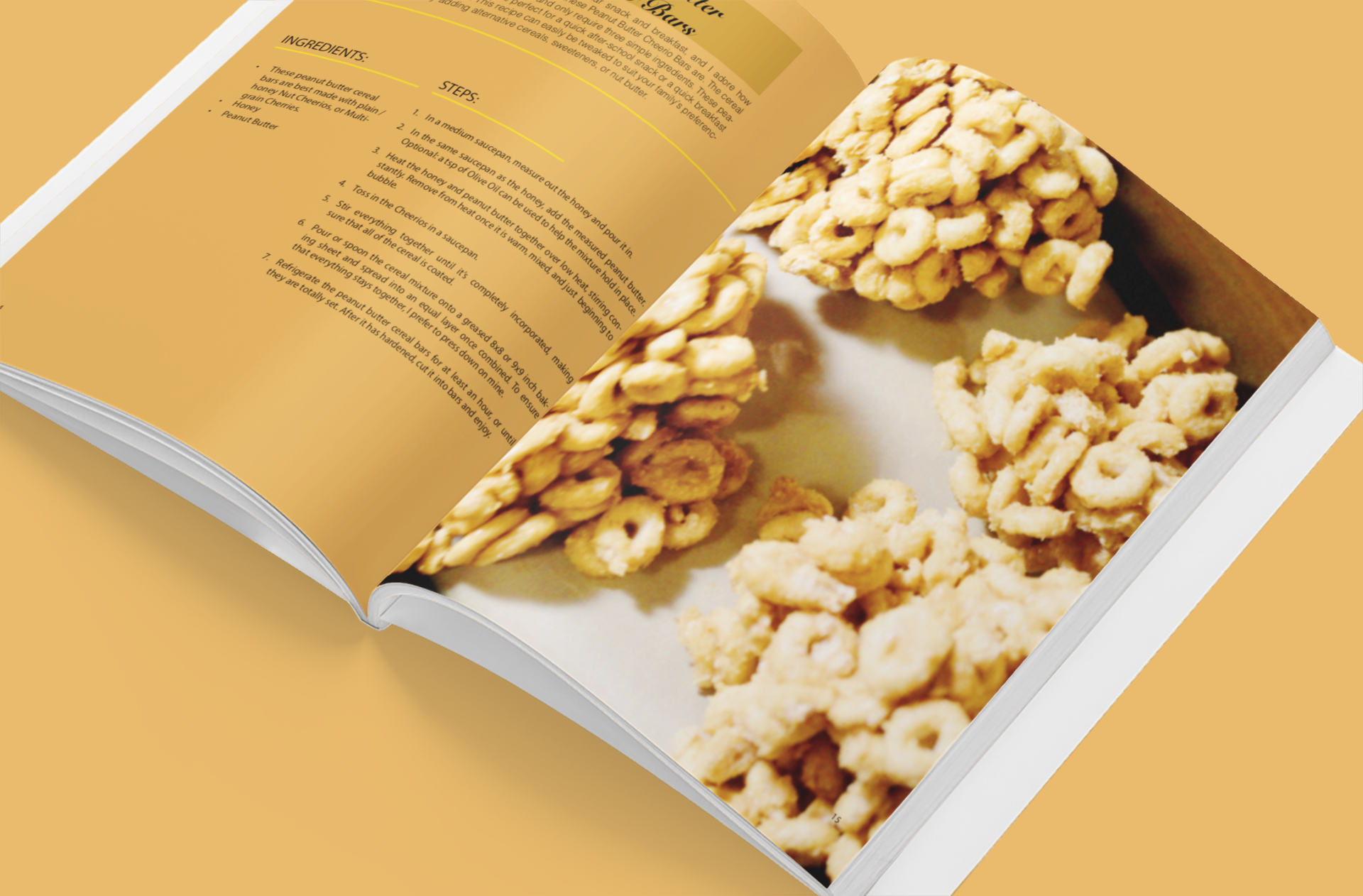
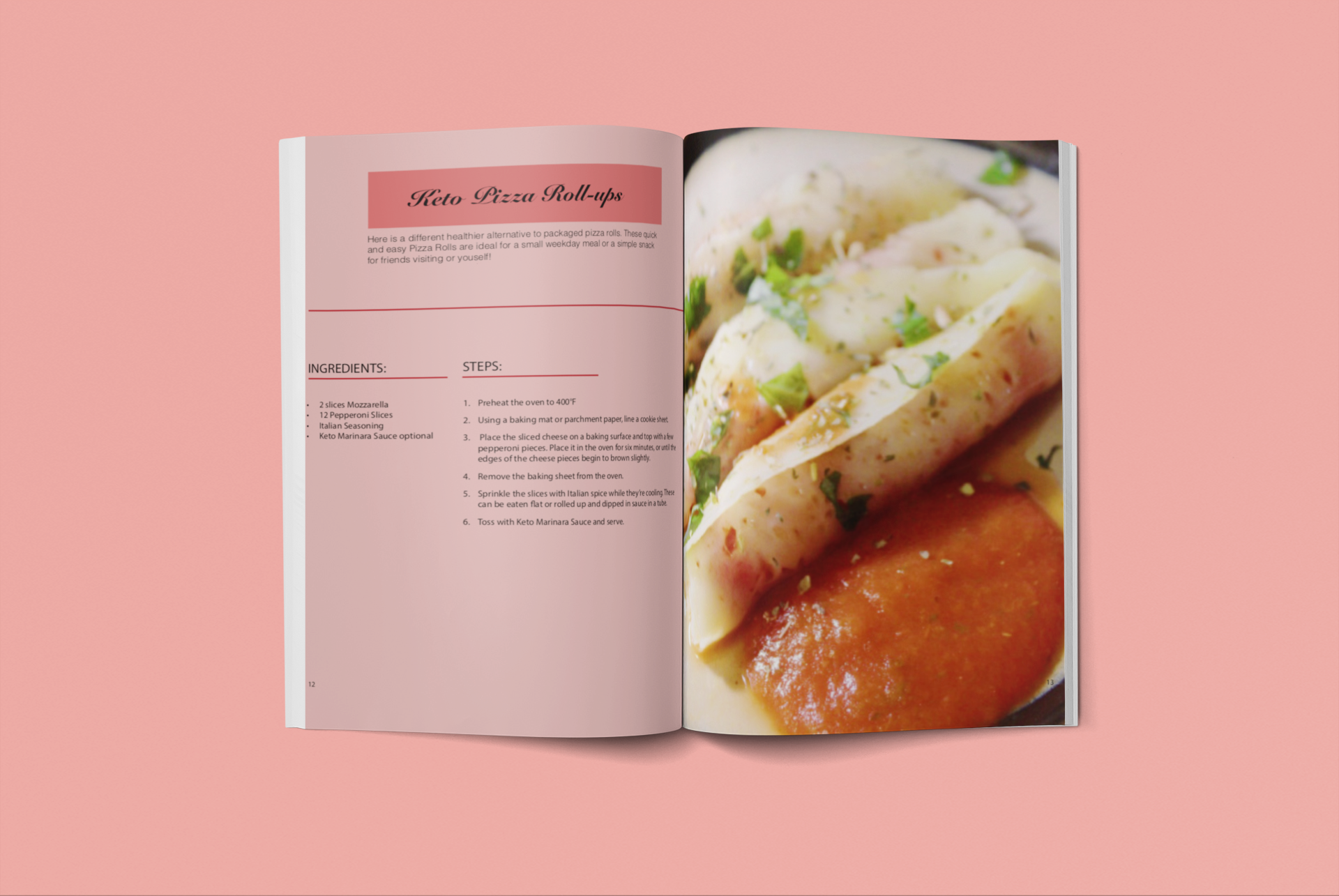
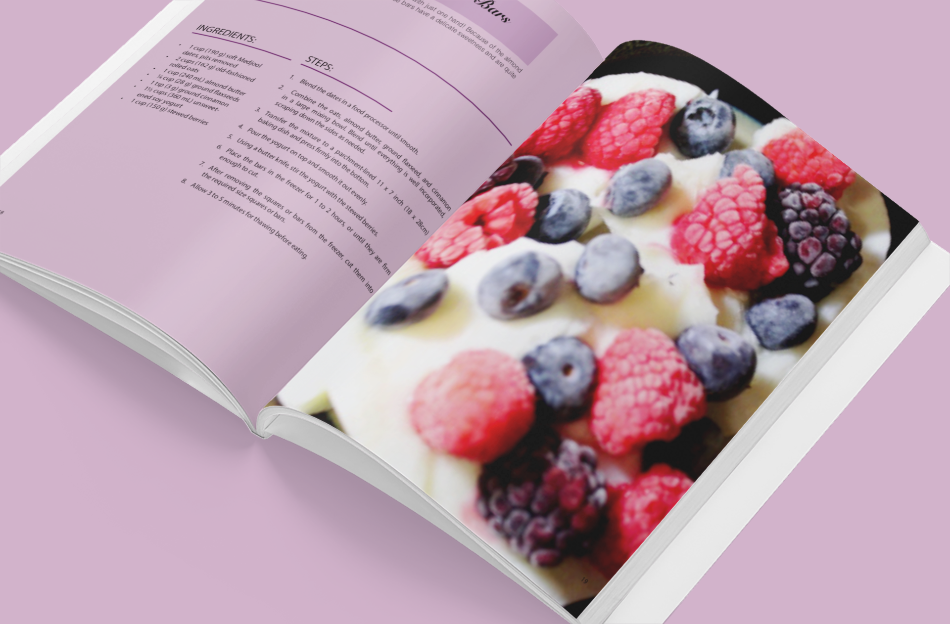
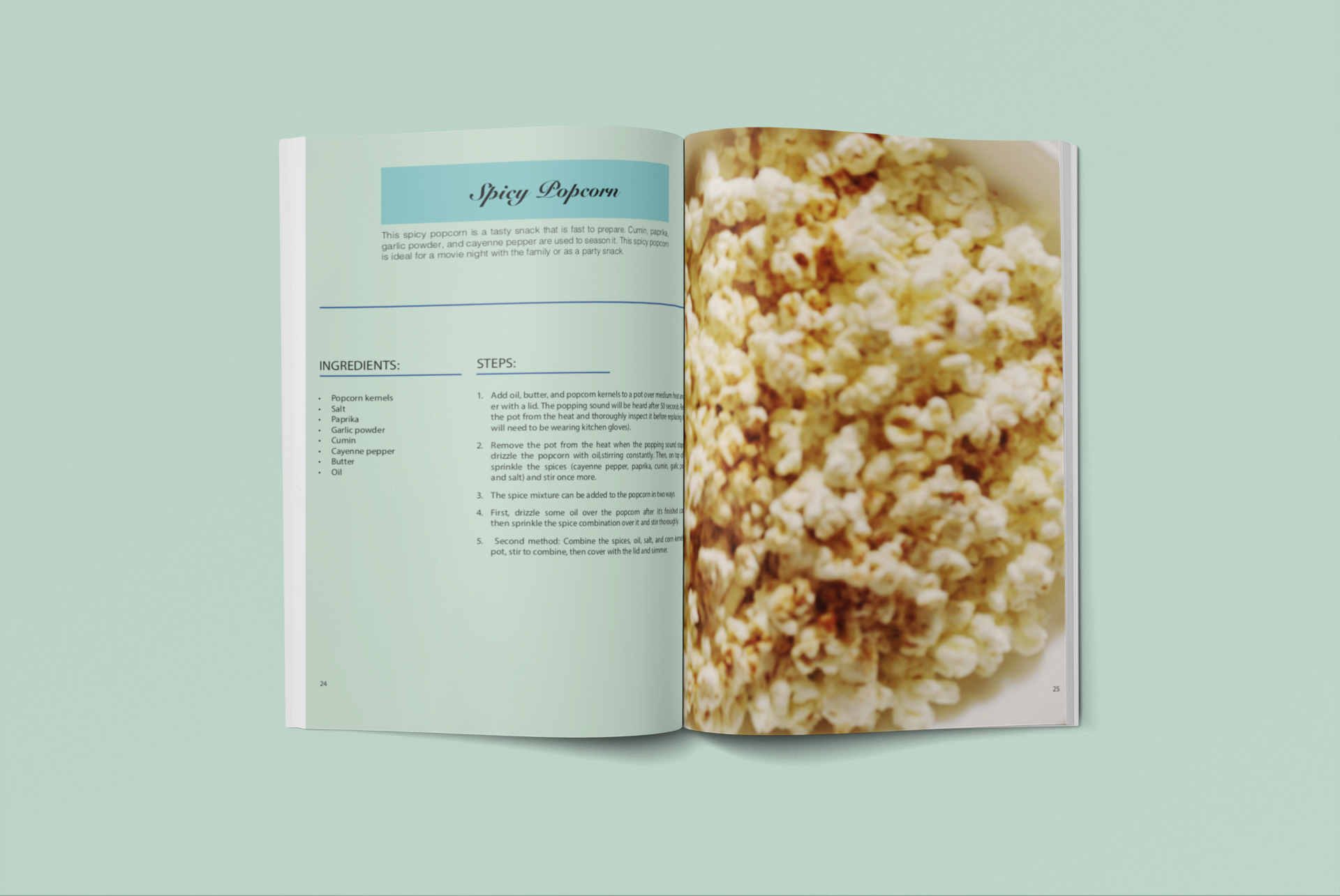
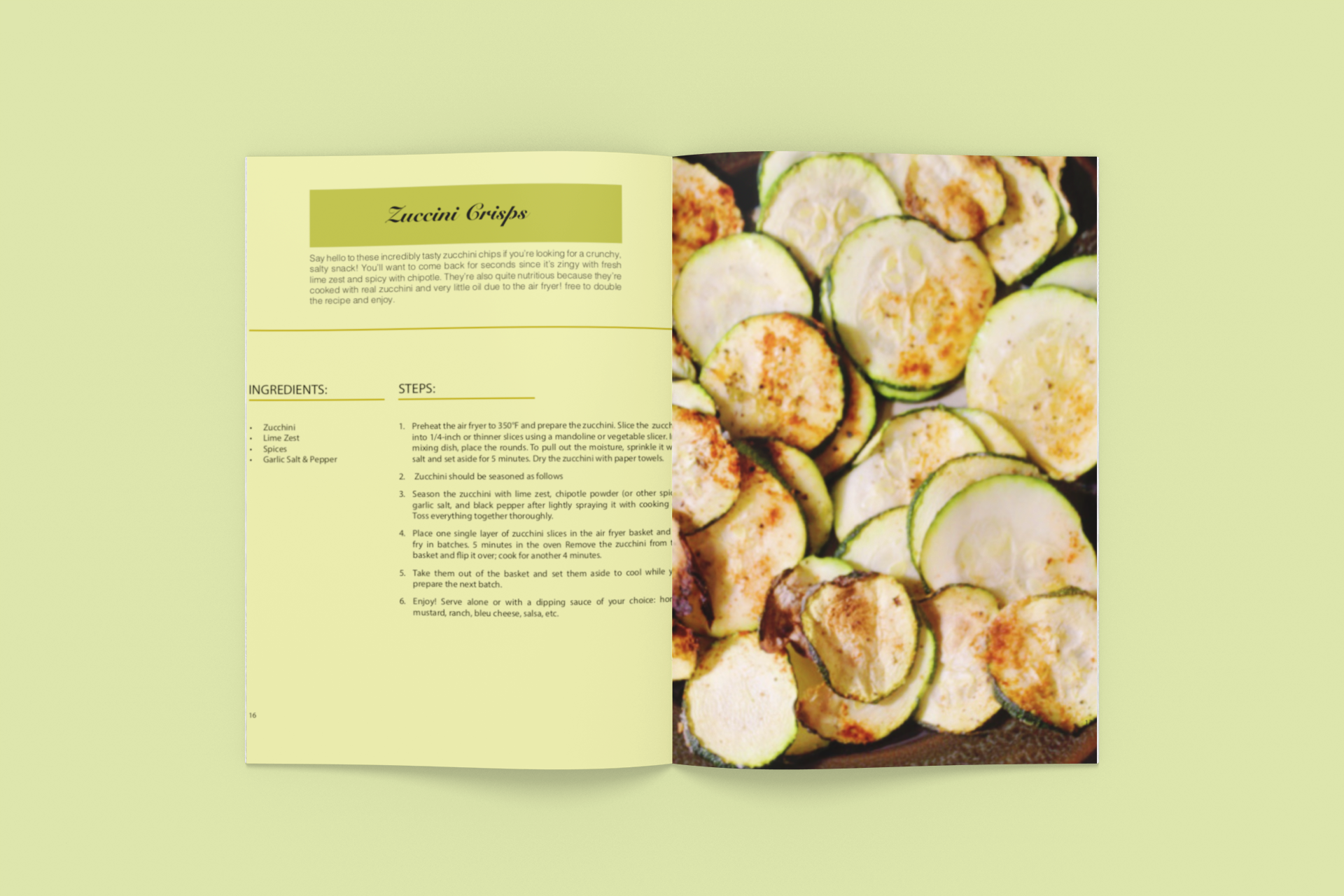
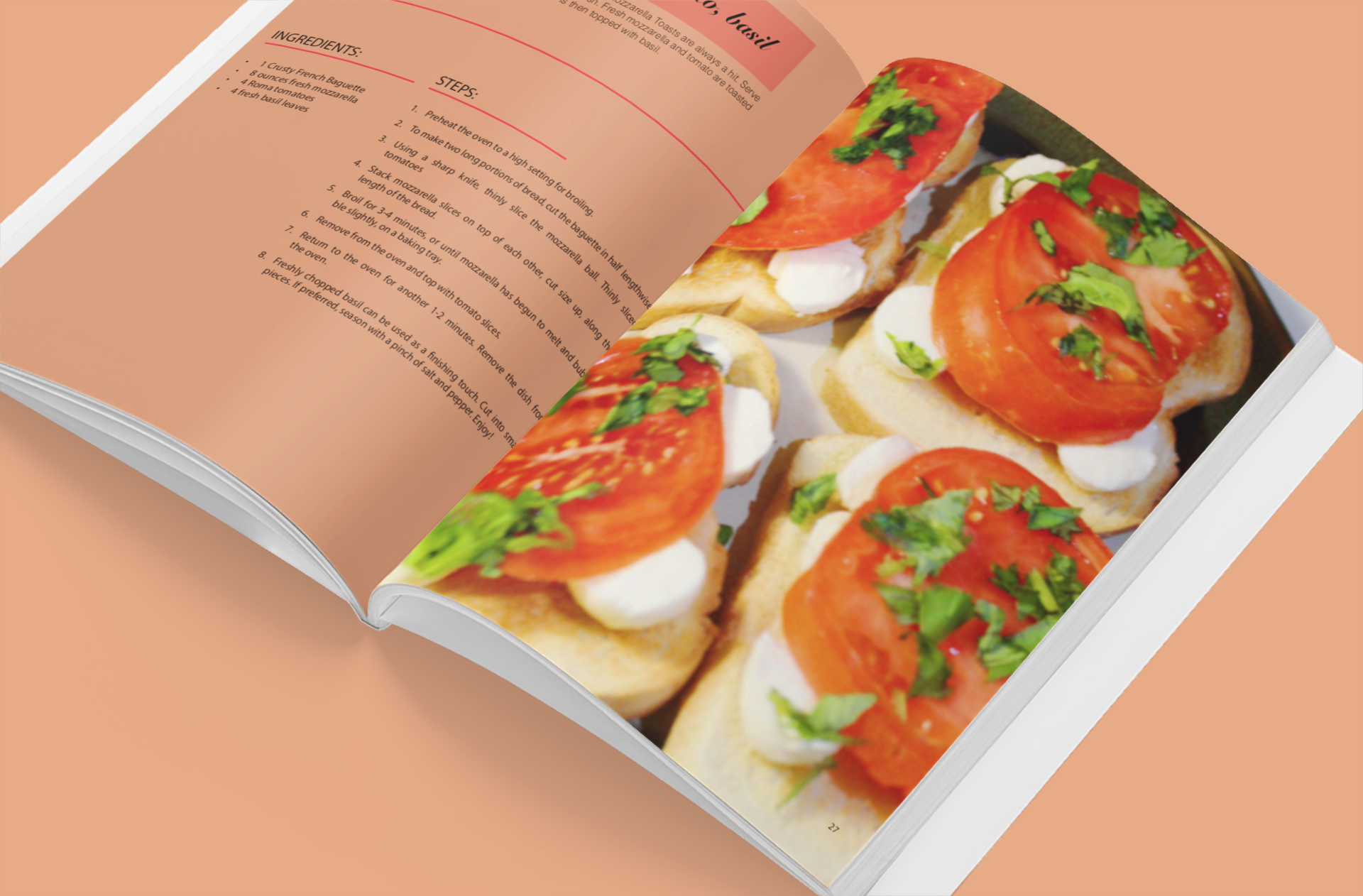
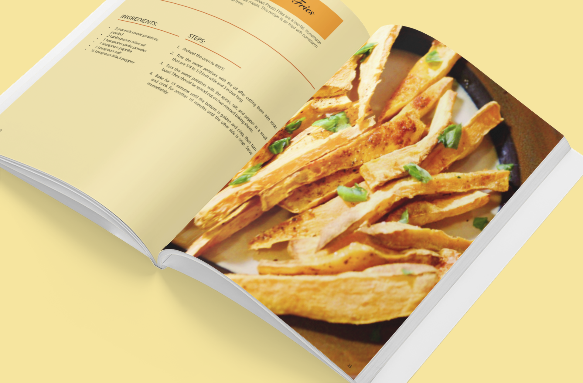
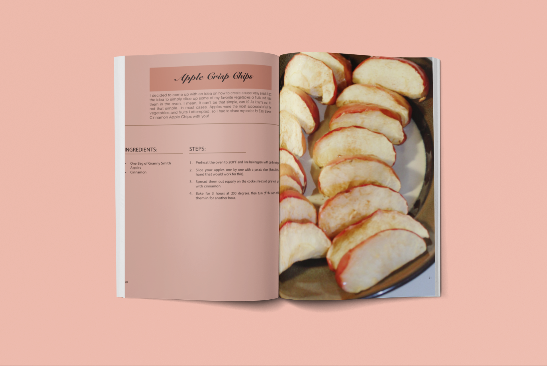
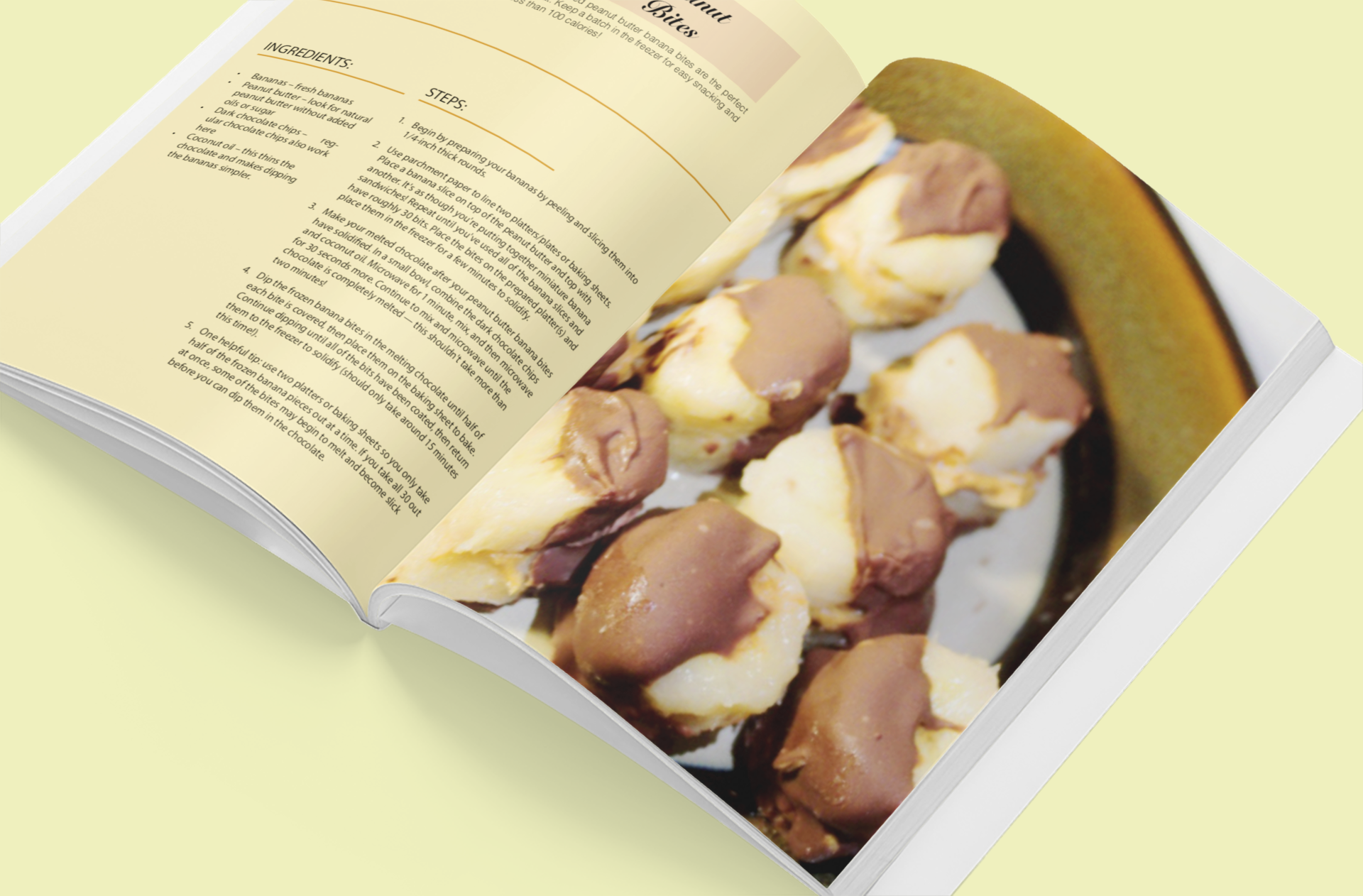
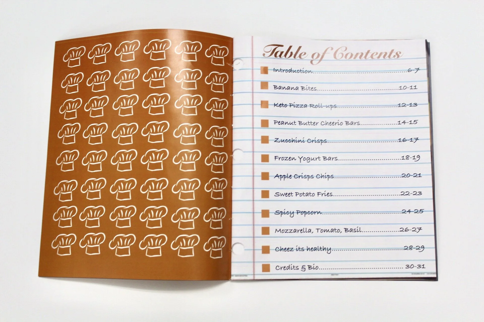
I made the alignment of the booklet and structure of the grid to be very simple so that it is easy to read. The grid is going to be used all throughout the book , so I believed that this part of the project was deemed very important. The grid I decided on was a 2 modular grid to focus on both the ingredients and steps of the recipe. I created this part of the grid with smaller individual squares for more intricate details, so I can be more precise on the left side. However, on the right side I made a pattern of three stretched out boxes that were less detailed, because I knew I was just going to put an image of the food product there. On the recipe page I decided to use some of the colors pulled out from the picture. For example, I made the Peanut Butter Banana Bites spread a yellow toned theme. The color of the page was yellow and the box where you read the recipe was a darker yellow and all the lines under the ingredients, steps, and recipe were all a bright yellow.


Evaluation

I used this basic technique throughout my spreads to create a colorful palette that went along with the theme of the book. I think my solution helps convey the individuality of each specific recipe, however even though the colors are all different they are all in the same tones which still helps unifies the book as a whole. Most of the tones were more pastels or lighter colors of the original color. I did this, because I didn’t want it to be  too dark or too light/bright of a color that could distract the reader from being able to read the recipe properly. I also used the typeface univers light for all the important information in the recipes, because it is simple and easy to read. For the cover of the book and the title of the recipes I used a typeface called Snell Roundhand, because it was also easy to read as well. However I also liked the wispy, almost hand-written effect of it and I thought it completed the theme of my book very nicely.
Next
Next

Savage Vintage Manifesto